Midnight in Paris - Reverse Engineering the Grade

Alexandros A. Apostolos on the Lift Gamma Gain forums posted this thread asking how to achieve the look of the Woody Allen films Midnight in Paris and To Rome with Love. Not seeing anything particularly complex in the look of either of the films, I decided to have quick go at trying to reverse engineer the grade. Seeing as both looks are quite similar I picked Midnight in Paris as it was easier to track down images of the same locations. Alexandros was mainly interested in the outside shoots featured in the intro, so I'll concentrate on those.
Getting Started
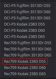
One of the first things I do when figuring out a look is to check IMDB to see if I can glean any info on the print stock used. It's quite likely that the print stock emulation LUT used during the grading process is then baked into the non film release versions of the movie. Therefore playing a large part in the overall look of the Bluray, DVD etc versions.

IMDB states the print stock as Kodak 2383, so I'm going to use a Kodak 2383 LUT but with a warmer D55 whitepoint. With a bit of experience it's quite easy to tell the whitepoint of the LUT used. The main tip off in Midnight in Paris is the overall warm cast throughout, particularly in the highlights - even in scenes that one would think would be neutral.
Resolve comes with several film look LUTs and actually has a D55 version of Kodak 2383. So using this LUT will put us on the right track...
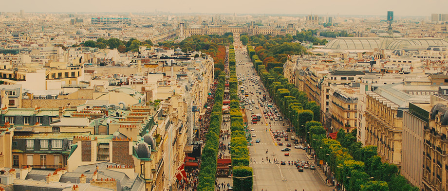
The next step is to find suitable images to grade. It's important to get as close to the original film images as possible. Looking at the intro sequence most shots are either overcast or rain soaked. Focusing on the overcast shots I tried to find images with matching location, angle and most importantly similar light conditions. I find Flickr is a great resource for this and a quick search yielded plenty of overcast images of Paris. Flickr is great because it allows you to download high res versions of the photos, so you can work in 1080p, UHD, 4k etc. Below each image I've included a link to the original photo on Flickr.
The Grade
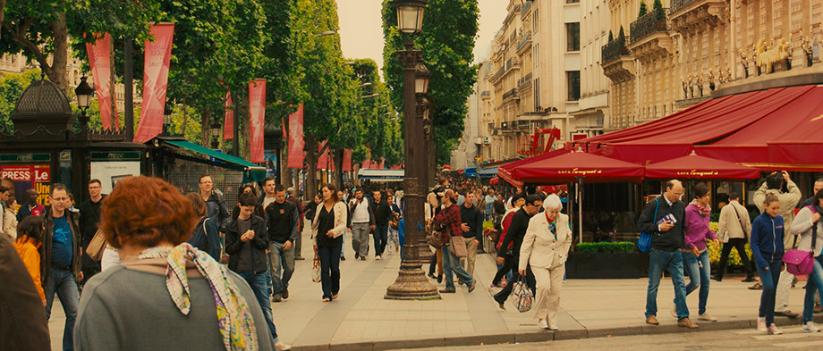
Below is a screen capture from the film. The first thing I notice is how warm the shot is overall. But at the same time the foliage is quite vibrant and pushing towards cool green, cooler than you would expect when warming an image this much. The red from the awnings and the man's polo are also extremely vibrant.

Looking at these images online - on this blog and perhaps next to other images you might have on your desktop, the warmth, the reds and greens undoubtably look too intense. But seen in the way they were intended I guarantee your eyes would become accustomed very quickly. And whilst they would still look warm, you would quickly buy into this warmer more vibrant world and it would start to look somewhat normal.
If it was me grading this I would be tempted to knock back the saturation on the whole image, especially in the greens and reds. But doing this I believe would remove some if not all of the uniqueness of the grade. And it would just look like regular old Paris.
Below is my version of the grade. The original photo on Flickr.
Here is the node structure:

Take note of where I placed my video2log conversion. I did this so late in the node graph so that I could do the majority of the work in the image's original SRGB gamma. When dealing with 8bit images sometimes I find a video2log conversion too early on in the graph can introduce artifacts as you're pushing the image's 8bits too hard and then making corrections on top of that.
Also take note of how the foliage is split into two nodes. One node cools most of the foliage but especially the darks, the other node pushes the highlights warmer and more vibrant. Something you wont be able to see is the warmth in the image is being added via the offset control in the Warm node.
And here is a video breakdown showing the effect of each node:
Midnight in Paris Grade Breakdown from Juan Melara on Vimeo.
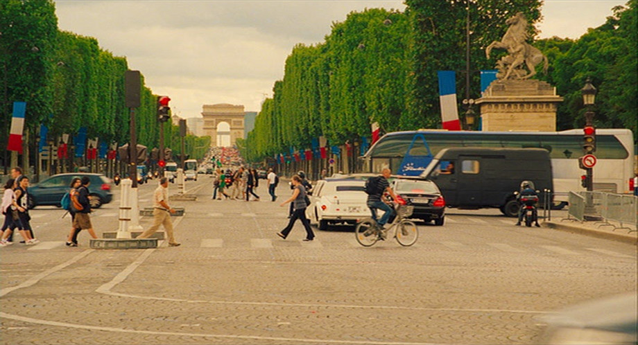
Below are a few more screen captures and my matched grades. I think a measure of how well you've reverse engineered a grade is how easily it can be applied to other source material. Very little tweaks were needed for all these images beyond the standard balancing in node 1.

Above - screen capture from the film.

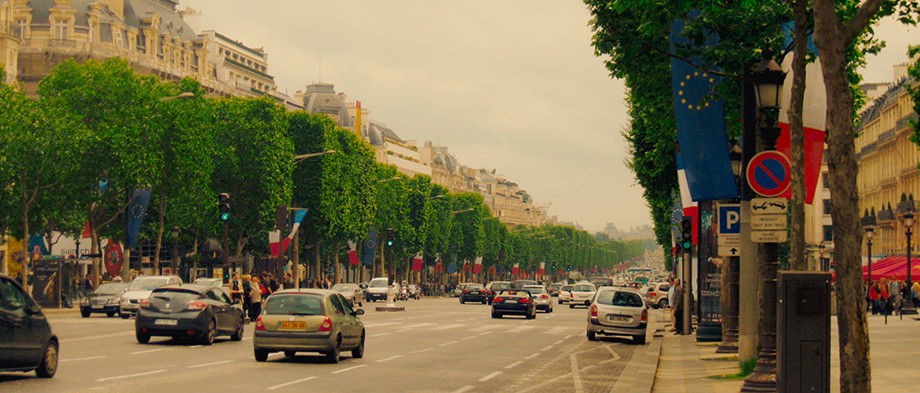
Above - matched grade. Original photo on Flickr.
Above - screen capture from the film.
Above - matched grade. Original photo on Flickr.
Above - grade applied to another source image. Original photo on Flickr.

Above - grade applied to another source image. Original photo on Flickr.