Necrophilia: A Love Story - Short Film

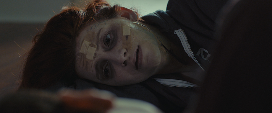
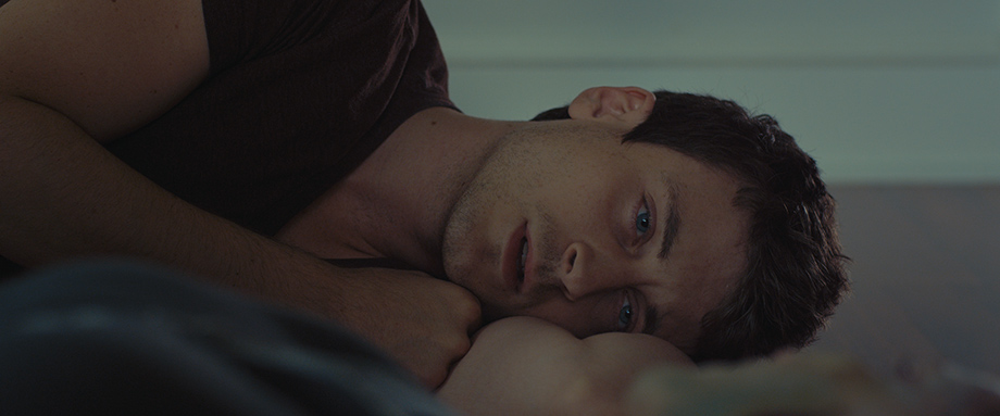
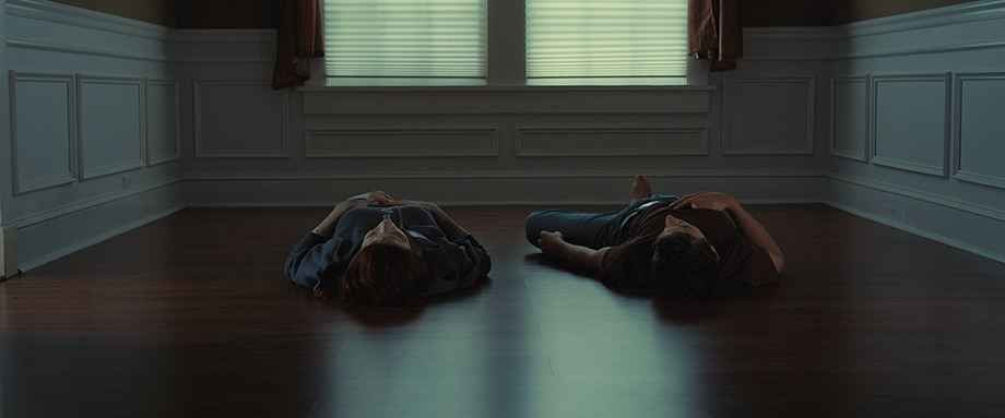
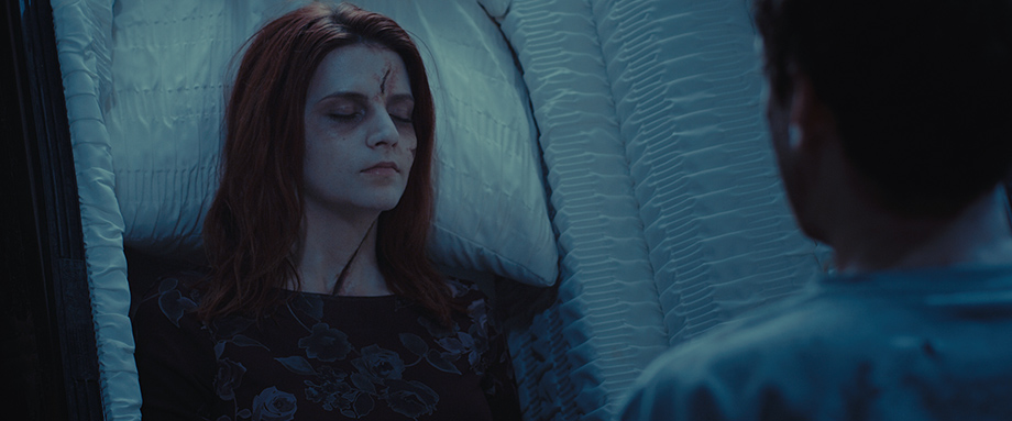
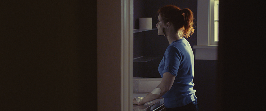
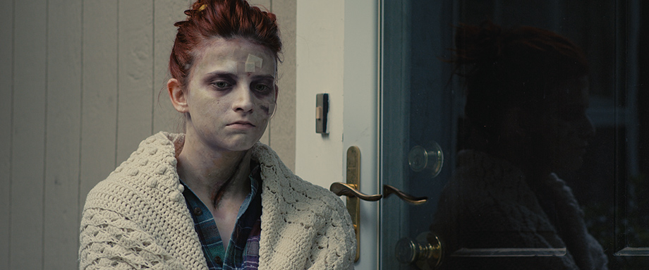
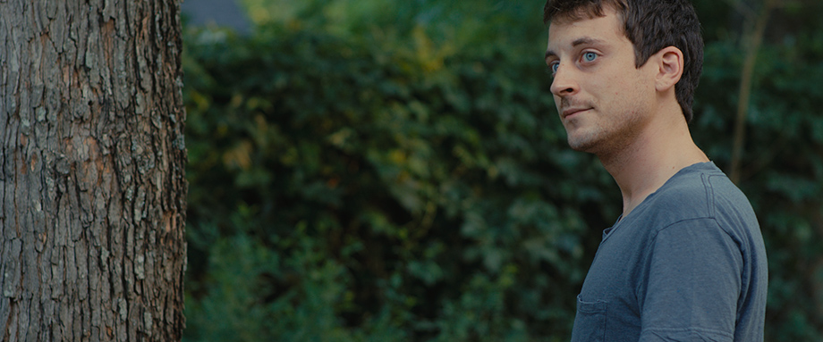
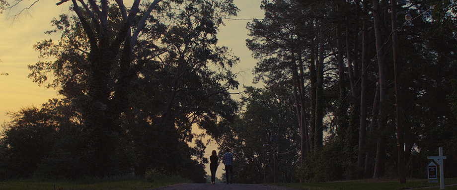
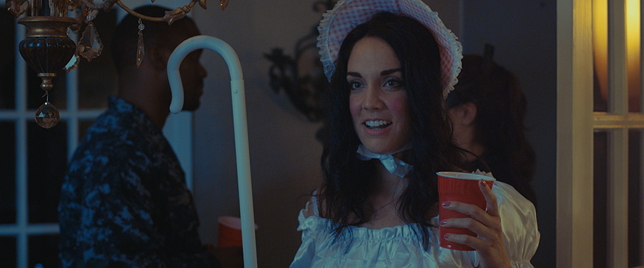
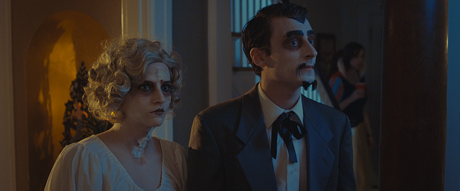
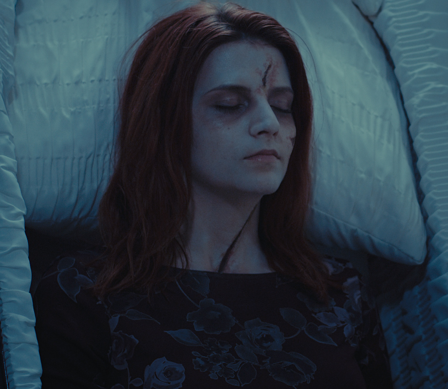
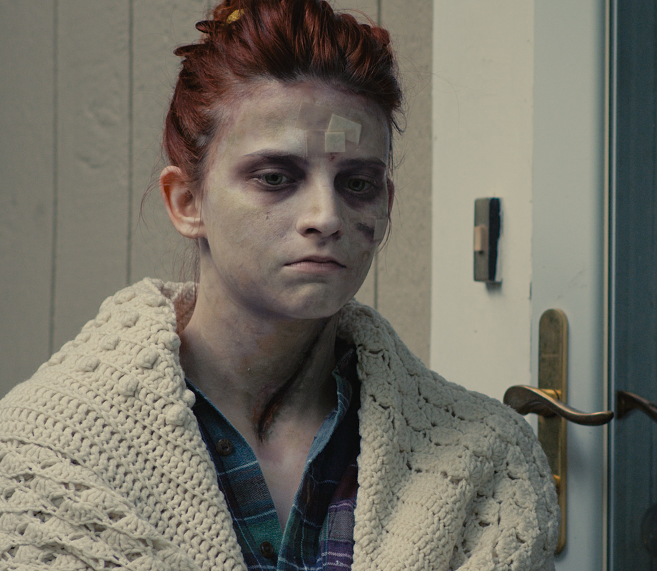
In October I graded a great little short film titled Necrophilia: A Love Story. It was written and directed by Michael Millichamp. It's currently doing the festival circuit, so it's unlikely it will be available to view online for a good while. I am however allowed to share a few frames. For more info on the short, check it's Facebook page here.
The grade
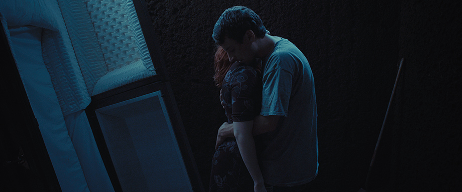
Necrophilia: A Love Story was shot on the Red Scarlet in 4k.
Similar to Deep Water, I used a D55 white point film emulation LUT. But this time it was a custom Kodak 2383 LUT. The differences between the 2383 and 2393 LUTs are quite minor. The 2383 has slightly more lifted blacks and seems to impart a bit more of a look on the footage – mainly more blue/green in the shadows. Overall the 2393 seems to be a little more neutral in both colour and curve. I went with the 2383 LUT as I felt the 2393 was probably a little too clean and clear in the shadows, which I didn't think suited this project.
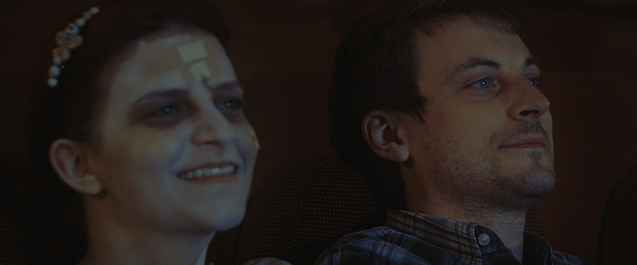
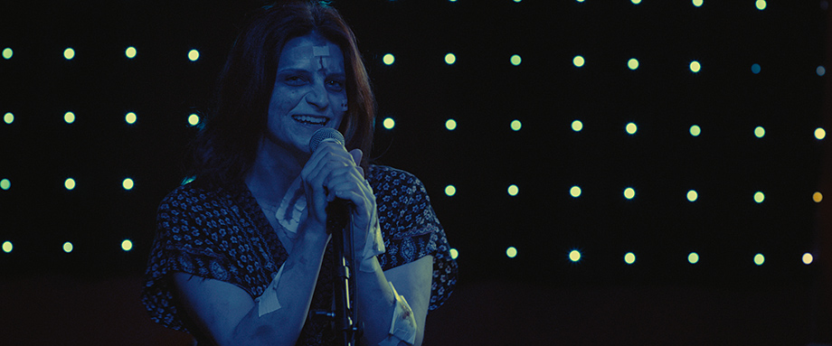
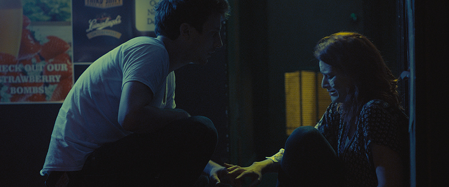
As with pretty much all projects I work on, the raw footage looked great straight out of the camera. Therefore the idea behind the grade was to enhance what was originally captured. For the night time grave shots and interior party scenes I used the summer blockbuster technique. Mainly too boost the cool night time look, rather than to create a teal and orange colour separation.
Keeping it consistent
Using the blockbuster technique in some scenes and not others created the risk that the grades would not match. There are several ways to ensure there is consistency between scenes. Probably the easiest way of doing this is to make sure your shadows/blacks are all roughly the same tint and density. Although quite subtle, I introduced a bit of red/purple into the shadows of every shot. This created an anchor for every scene/grade. So no matter what was happening in the midtones and highs (within reason), the grades work as they appear to be built on the same foundation. It's important to point out that the tint is only just visible in the area above black – the upper shadwows. Below a certain luminance as the shadows approach true black the tint is no longer really visible. I find its crucial to keep the deepest blacks tint free, as this retains a naturalness to the grade. Otherwise its easy to start heading into heavy tint instagram filter territory – which isn't always desired.
The same idea applies to the highlights. Although I find it isn't as crucial in achieving consistency as it is with the shadows.
How to...
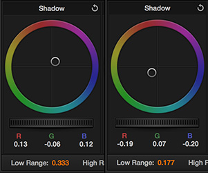
So there are a few ways to introduce a tint into the upper shadows whilst still retaining relatively neutral blacks. The quickest and still relatively precise way of doing it is using the shadow log wheel. I usually do my shadow tints towards the end of the node graph usually in the last couple of nodes. On the first of the shadow tint nodes I add the main tint – purple in the example below (left). In another node downstream, I use the shadow log wheel again but this time with the low range adjusted to a value below the low range value in the previous node (right). Then I push the wheel towards the complementary colour of purple, which cancels out the purple tint but only in the lower range. Thus returning the blacks to neutral.
The other method I sometimes use is to setup the first tint node exactly the same, but on the next node I create a luminance qualifier to isolate just the blacks and lower shadows. Then I desaturate them. This method can work quite well although there are two things to be aware of:
- If the over all look of your grade is warm, desaturating your blacks will push them towards neutral. But neutral desaturated blacks will actually look cool in comparison to the rest of the warm grade – something which might not be desired.
- Desaturating your blacks returns them to neutral, but in doing so you also lose chroma (obviously). Again something that might not be desired. This isnt always obvious, but if your luminance qualification reaches too high up, it can be quite visible.
These are the benefits that the 2 node complementary colour setup has. 1. You can avoid having neutral blacks that don't fit in with the overall colour temperature of your grade, as you can put them wherever you like – not true neutral but neutral within your grade's colour palette. 2. And no matter how much of a tint you have in the first node, you can always return the lower shadows/blacks to neutral without losing any chroma.